I’ve wanted to write something about Infomentum's scrum board since its inception in late 2012. Now seemed as good a time as any to share the story...
During an end of sprint retrospective, one of our developers Jakub said “I'm bored of the board.” That didn’t surprise me.
We'd been doing two week sprints since much earlier that year, and after rough calculations, I realised that the team had been standing next to the standard scrumboard for about 45 hours...not all in one go, obviously. That was 20 sprints * 9 days per sprint * 15 minutes per stand up; i.e. a lot of time standing in front of a boring board.
It was good timing really. We'd just done a major deployment, so were in a period of warranty and bug fixing - and that meant I had a bit more time on my hands. I went Googling, and found Craig Strong’s super hero scrum board. It was the inspiration that gave me the following:
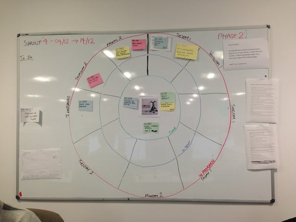
Bullseye board 1.0

This was very much a first draft. The board is looking pretty different these days (I'll come to that in a moment), but the techniques of how we use the board hasn't changed.
Board structure
The main point of the board is that it focuses the eye on the sprint goal and the mascot in the middle. That's where we’re aiming. That's where we want to get all of our user stories to so that we can achieve the sprint goal and appease the mascot (who happens to be Dominick the Christmas donkey in the above picture). We (try to) choose or create a funny mascot for our sprints that is loosely connected to the goal.
The board is divided into segments, each representing one day in a sprint. At the time, we were doing two-week sprints, with one day written off for the review, retrospective and planning. On the left of the circle, you can see the area where we put out 'To-Do' user stories. We only put user stories, not tasks, on the board; we use Jira, so sub-tasks are managed there. I think the board gets too messy if you try to include a card for each sub-task as well. We also have high-level technical tasks in our sprints (e.g. Set up UAT environment), which are chunky enough to be on the board as well.
The outer red circle is for 'In Progress' user stories - these are stories that developers are working on, but haven't been passed to the tester on the project yet. On the first full day of the sprint (usually a Tuesday) we have a different type of daily stand up, where the whole team discuss a rough plan of when the various stories will be available to the tester so they can properly get their hands on it and start finding bugs, e.g. a developer starts a story and based on the tasks, and their workload, they believe it will be ready for testing on Monday of week 2 - so they place it in that segment.
The idea behind this is to create an even distribution of stories across the whole sprint. It allows the tester to test throughout the sprint, and avoid cramming all of the testings into the last day or two. If this happens, testers won't be given the time they need to make sure the definition of done is met. If/when they find bugs, fixes for those bugs might not be possible in the sprint, leading to technical debt or a bad sprint review.
Highlighting this scenario is the first tangible benefit of this board; it highlights when your sprints are becoming mini waterfall phases. If at any point during your sprint the majority of the story cards are in the final two segments of the board, something has/is going wrong. And with this board, there’s no getting away from it. Everyone can see it.
The ensuing discussions have brought out several root causes across projects I’ve worked on:
- Dependencies on a 3rd party providers (incorrect documentation, lack of access to environments, randomly turning things off) meaning development took longer than expected and held up other work;
- Large user stories that had too many areas of complex functionality within them; they needed to be sliced so they could be more easily understood, developed and tested;
- A developer hanging onto their work for too long until they perceived it to be perfect before releasing it to test; this was due to their misplaced sense of ownership;
- Bottlenecks on certain team members or skill sets;
- Inter-dependencies on tasks and stories.
During the daily scrum, the team then reassess relevant stories as they discuss what they’ve been working on. The physical act of having to move a story further around the circle forces a discussion about why and what the rest of the team can do to help remove the impediments that may be blocking the developer(s).
The next circle is In Test. The developer moves a story there once they’re happy their tasks are complete. The tester then moves it round to the section representing the day that they think they’ll be able to finish testing. Once the tester is happy the story meets the definition of done, they place it in the bullseye.
Bullseye board 2.0
Since the original attempt, the board has evolved and sharpened up its look. Firstly, Alecia and Erin used a simple string and Blu Tack technique to make a much neater circle, dividing it into something approaching equal segments. We also used the South Park avatar to create a likeness of each other. The rest of the team were encouraged to follow suit after I had created my own - highlighting my lack of hair and slightly angry face. These avatars are used to show who is working on which story, and also just to have a bit of a laugh with each other. It may sound like forced fun when agencies say “we’re cool and relaxed, we have an Xbox in the office”, but it just creates a bit of informality. It’s a talking point. It starts a conversation, and that for me is the most important thing; people interacting. People from outside the team often want an explanation as well!
The finale: bullseye board 3.0
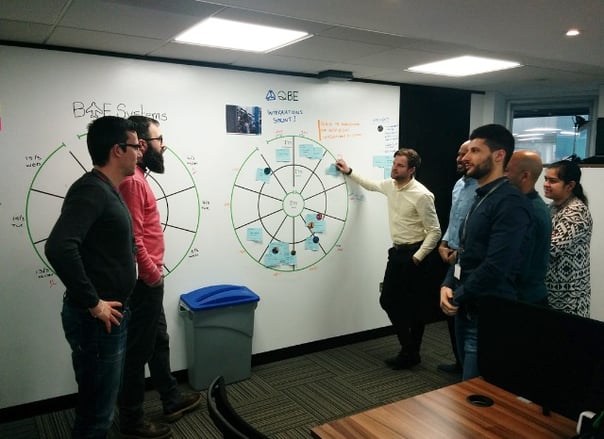
The next significant version (also our current version) was created when we moved to our new office on Jewry Street in April 2015. Most of the walls are painted with whiteboard paint, so it was the perfect opportunity to get one of our designers to work their magic on creating our on-brand bullseye board. We had it printed as a wall sticker on the whiteboard walls:

But why the bullseye board?
For me the board has the following benefits:
- Focuses on the goal and the mascot
- Represents the cyclical nature of Scrum
- Highlights when sprints are just becoming mini waterfall phases (all testing at the end) and help us to remain agile
- Highlights when stories are continually slipping around the board, so that we can address and remove impediments more quickly
- Because of all the room around the board thanks to our whiteboard walls, it becomes an informal team noticeboard where anything can be shared
- The use of avatars allows people to quickly see who’s working on what
- Creates a talking point for those in and out of the project.
All in all, it's been a great success for us - that's why it's still going strong after 5 years.


